How to build a high-converting product page for New SterlingPro that sells in Nigeria
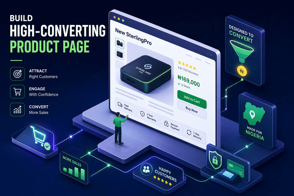
When someone searches for the new SterlingPro in Nigeria, they are not browsing. They are ready to act. That search intent is warm, specific, and valuable, and most product pages squander it within a few seconds. A slow page, a vague headline, or a layout built for a desktop screen is enough to send that buyer straight back to the search results.
This guide gives you a practical, step-by-step framework for building a product page that captures that traffic and turns it into real orders. Samuel Igwe of Young Sentinel Digital Concept has worked with Nigerian sellers facing this exact problem, from cluttered launch pages losing buyers at the hero section to checkout flows that reveal hidden fees and trigger abandonment. The lessons from those projects are distilled here into a playbook any seller can apply. By the end, you will know exactly what your page needs to look like, say, and do, and where the quick wins are.
Why most product pages lose buyers before the first scroll
The problem is almost always positioning. A seller launches a page that answers every question except the one the buyer is asking first: “Am I in the right place?” Nigerian buyers have been burnt by online purchases. They arrive with a healthy level of scepticism, and a weak hero section confirms their worst suspicion that this might be another dodgy storefront.
A vague headline, a product image that could belong to any category, and a sub-headline that lists features instead of outcomes all work against you. Research on mobile user behaviour consistently shows that buyers make their stay-or-leave decision within two to three seconds of landing. If the page does not immediately confirm that this is the new SterlingPro platform they searched for, they leave.
The one thing your page must confirm in three seconds
This is the concept of message match, and it is the number-one silent conversion killer. When a buyer arrives from a search for a specific product, the headline, the hero image, and the sub-headline must form a single, unified confirmation: “Yes, this is it.” If there is any gap between what the search suggested and what the page shows, the buyer’s brain registers a mismatch and moves on. Your headline is not the place to be clever; it is the place to be unmistakably clear.
Positioning your new SterlingPro offering for the Nigerian market
Local context matters more than most sellers realise. Nigerian buyers are price-sensitive and aware of alternatives, but they are not unwilling to pay. They want to understand why your product is worth it, and they are particularly attentive to whether the “new” version of a product represents a genuine upgrade or simply a rebrand of the same thing.
A practical positioning approach: state the core benefit plainly, connect it to something locally relevant, a problem the buyer recognises from their own experience, and follow immediately with proof. That sequence builds credibility before the buyer has scrolled past your hero section. Think of it less as a formula and more as the three questions your opening paragraph must answer before the buyer asks them aloud.
New SterlingPro: mobile-first design for Nigerian buyers
Over 75% of web traffic in Nigeria comes from smartphones. Designing your product page for a desktop screen and hoping it scales down is not a strategy; it is a way to guarantee a high bounce rate. Your page must be built for the small screen first, with every design decision accounting for the fact that your buyer is loading it on a data plan that costs real money.
The layout structure that works on a Nigerian mobile screen
The proven mobile layout follows a single-column structure. Start with a strong hero image paired with a benefit-led headline above the fold. Place your primary call-to-action button immediately below the hero, before the buyer scrolls. Follow that with a short feature-benefit block of three to four points presented visually, not as dense text. Add a social proof strip with customer photos or a review count, then use a sticky “Order Now” button that travels with the buyer as they scroll. A multi-column desktop layout collapses badly on a 5-inch screen and forces the buyer to pinch, zoom, and work harder than they should.
Page speed as a conversion tool, not a technical afterthought
Pages that take longer than three seconds to load begin losing buyers at a meaningful rate. One client project in the Young Sentinel Digital Concept portfolio recorded a 50% bounce rate when load times exceeded seven seconds; bringing that figure below three seconds produced a significant improvement in sessions that reached the order form. Compress your images to a modern format such as WebP, which typically reduces file size substantially compared with older formats. Use a hosting provider with CDN nodes close to your primary customers, ideally within the region, and remove heavy scripts that block the page from rendering above the fold. These are not optional technical improvements; they are the difference between a page that sells and one that loads into an empty session.
What a high-converting layout looks like in practice
Picture a typical cluttered product page: multiple navigation links, a hero image that takes four seconds to load, a headline that reads “Quality Product Available Now”, and a price buried below three paragraphs of product history. Now compare that to a clean, single-column mobile layout with a benefit-led headline, a sharp product image compressed for fast loading, a clear price with delivery fee included, and one prominent CTA button. The second page does not require more content; it requires better hierarchy. That hierarchy is what the team at Young Sentinel Digital Concept applies when rebuilding client launch pages, and the difference in buyer behaviour is immediate.
Writing copy that earns trust from the Nigerian buyer
Design brings the buyer to the page; copy keeps them there and moves them to act. Nigerian buyers are experienced, sceptical, and increasingly informed about how online selling works. They carry specific concerns about authenticity, about delivery, and about what happens if something goes wrong, and your words need to respect that intelligence while speaking directly to those concerns.
Headline formulas that speak the buyer’s language
Several headline structures perform well on Nigerian product pages. The result-led headline focuses on the outcome: “Get faster corporate payments without the branch queue.” The specificity headline names the product and its benefit directly: “The upgraded SterlingPro platform that handles bulk salary transfers in minutes.” The comparison headline positions the product against the buyer’s existing option: “More payment control than your current banking setup, at zero transfer fees.” Each of these answers the buyer’s core question before they have to ask it, and all three are worth testing against your current headline to see which resonates most with your specific audience.
Social proof that Nigerian buyers actually believe
Generic five-star reviews feel manufactured to a Nigerian audience. What works is proof that looks real: a short video testimonial filmed on a phone, not in a studio; a written review that names a specific benefit and includes a photo; a sales counter that is specific and current rather than rounded to a suspicious “10,000+ customers”. Place your strongest proof close to the price and the CTA button, not tucked at the bottom of the page. Proof that appears near the purchase decision reduces the mental risk the buyer has to take.
Addressing price objections before the buyer asks
Nigerian buyers do not refuse to pay; they refuse to pay without understanding the value. The price-justification block handles this directly. State the price clearly, then immediately follow it with a value stack: list exactly what the buyer receives, in plain language. Close with a risk-reversal element, a returns policy, a satisfaction guarantee, or a pay-on-delivery option where applicable. Pay-on-delivery is a strong trust signal in the Nigerian market because it removes the fear of paying and receiving nothing. This structure transforms the price from a barrier into a summary of everything the buyer is gaining.
Pricing display and fulfilment transparency that reduce abandonment
Two triggers cause more abandonment on Nigerian product pages than any other: surprise delivery charges revealed at checkout, and uncertainty about whether the product will actually arrive. Both are preventable, and fixing them requires nothing more than honest, upfront communication.
How to display pricing without triggering doubt
Show the full delivered price early. ₦12,500 delivered is psychologically different from ₦10,000 plus ₦2,500 delivery revealed at the payment stage. The first figure feels complete and honest; the second feels like a trick, and buyers who feel tricked do not complete orders. For sellers running pay-on-delivery, communicate that option clearly and prominently; it signals confidence in the product and removes the primary hesitation most first-time buyers carry.
Fulfilment details that reassure the buyer before they order
Your page must answer the questions the buyer will have before they commit: When will it arrive? Which courier handles delivery? What happens if the product arrives damaged? How do I reach someone if something goes wrong? Answer these directly on the page, before the buyer has to hunt for them.
A short “How it works” section, Order, Confirm, Dispatch, and Deliver reduces the mental load for first-time buyers and builds the confidence they need to complete the transaction. Keep it visual, keep it brief, and position it between your social proof and your order form.
Simple A/B tests and email sequences that keep buyers coming back
A product page is not a one-time build. It improves with deliberate testing and a post-purchase strategy that turns a single order into a repeat relationship.
A/B tests any seller can run without a developer
Start with three high-impact, low-effort tests. First, test your CTA button text: “Order Now” versus “Get Yours Today” can produce meaningfully different click rates. Second, test your hero image: a product photograph on its own versus a photograph showing the product in use. Third, test the placement of your social proof: above the price versus directly below it. Tools like PostHog offer a generous free tier and work well for custom websites; Zoho PageSense provides a no-code testing environment from around $14 per month. Run one test at a time, measure completed purchases rather than clicks alone, and keep tests running long enough to gather meaningful data.
A post-purchase email sequence that builds retention
Four emails, sent over fourteen days, are enough to build a retention habit. Email one goes out immediately after the order: a confirmation with usage tips or setup guidance. Email two goes out on day three: a check-in that offers troubleshooting help and signals that you are available. The seventh-day email requests a testimonial, ideally with a small incentive such as a discount on the next order. The fourteenth-day email is a re-order prompt or an upsell to a complementary product. This sequence works even on a small list, and it can be set up with affordable email tools that do not require a large upfront investment.
How Young Sentinel Digital Concept rebuilt a launch page from the ground up
One client came to Young Sentinel Digital Concept with a product page that was losing buyers at every stage. The hero section had no clear headline. The layout was built for a desktop screen and collapsed on mobile. There was no social proof above the fold, and delivery charges appeared only at checkout, after the buyer had already committed time and attention to the order process.
Before and after: what one page rebuild changed
The rebuilt page was a single-column, mobile-first layout with a benefit-led headline that confirmed the product immediately. Trust badges and customer photos appeared within the first scroll. The price included delivery, stated clearly before the buyer reached the order form. A sticky CTA button followed the buyer down the page. Within eight weeks of the rebuild going live, the client recorded roughly a 35% improvement in the proportion of visitors who reached the order confirmation page, alongside a meaningful drop in cost per sale. The changes were strategic rather than cosmetic, and the results reflected that.
Your next step: audit, build, or launch ready
If you want to evaluate your existing page against this framework, a launch checklist addresses every element discussed above: hero section clarity, mobile layout structure, copy formulas, proof placement, pricing transparency, and fulfilment communication. If you want expert eyes on your page before your next campaign goes live, the team at Young Sentinel Digital Concept offers a low-cost audit designed specifically for Nigerian product sellers. And if you want to skip the build entirely, a ready-made funnel package gives you a launch-ready page without the back-and-forth of a full custom project. Reach out to the team directly to discuss the right starting point for your situation.
A product page that earns its traffic
The new SterlingPro platform does not need a complicated page. It needs a clear, fast, trustworthy one, built for the Nigerian buyer’s context and tested to improve over time. The core moves are:
- Nail your positioning in the hero section so the buyer confirms they are in the right place within two to three seconds
- Design for mobile first with a single-column layout andfast load time
- Write copy that earns trust and addresses objections before the buyer raises them
- Show pricing and fulfilment details honestly and early
- UseA/B testsand a post-purchase email sequence to improve performance over time
Sellers who invest in ongoing iteration, rather than treating launch day as the finish line, are the ones who scale consistently. The page you publish today is a starting point, not a final answer. Samuel Igwe and the Young Sentinel Digital Concept team are ready to help you build that starting point properly, or improve the one you already have.